When is a good time to buy a stock?
Good question… and not having a crystal ball that can foretell the future, there REALLY isn’t an ideal scenario that will work every time.
There is one technique that I often use, and CAN help you in finding an entry point when buying a position of stock. And, although I would admit that this technique won’t work 100% of the time, it does have a high probability of working for you.
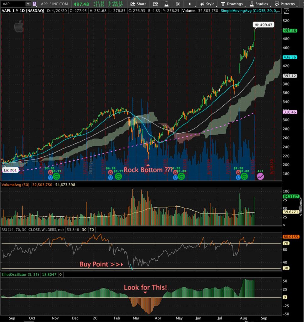
Let’s look at the chart below of Apple stock (AAPL):

Some Quick Notes About the Chart
The top part is simply a candlestick chart, with three indicators below it: A volume indicator, an RSI indicator in the middle, and at the bottom we have the ElliotOscillator indicator.
The Obvious Dip
The candlestick chart shows an obvious dip, and during the time at which you would see the dip occurring, there is no way you’d know you’ve hit rock bottom until the price action begins to bounce back to the upside.
Once the stock price begins to rise again, this could be a good time to buy the stock, but we need to look at the indicators below to tell us more.
Volume Indicator
As the stock price plummets, we see a major sell-off of the stock, which causes a snowball effect as the stock price continues to drop. This is marked by more red days than green.
Once the bottom has been established, you’ll see more steady buying as we see more green days in which investors are buying once again.
RSI Indicator
The RSI indicator (the middle one) is a great way to tell if a stock has been oversold. And this is an obviously easy one to recognize, but you can see where it says “buy point” and the indicator line turns blue, that the RSI has fallen below 40, and that the only direction it can go is up again, given that a stock doesn’t fall below 30. At this point the stock has a very good probability of going up, thus a good time to buy.
Elliot Oscillator
The bottom indicator is the Elliot Oscillator, which will chart a stock’s performance as it moves either above or below a “0” median line. When it falls below zero it goes orange or red, and when it rises above zero it becomes green.
When the orange lines start to rise and get close to zero again, this could be an excellent time to buy.
Final Thoughts
I typically use a candlestick chart with the above three indicators to determine entry points from a technical standpoint. Of course, breaking news and news pertaining to the stock will have a sudden impact on performance.
And this chart is a one year chart, meaning it goes back one year from the present, and I think this is a good time frame to use when looking at the potential to buy, whether it’s a shorter time frame or a longer one. A stock’s one year performance is helpful in gauging the general direction of the stock, and an upward trend is good when day trading, swing trading, or long-term investing.
I use 1, 3 and 5 year charts when looking at long-term investments in stocks.


Related Posts